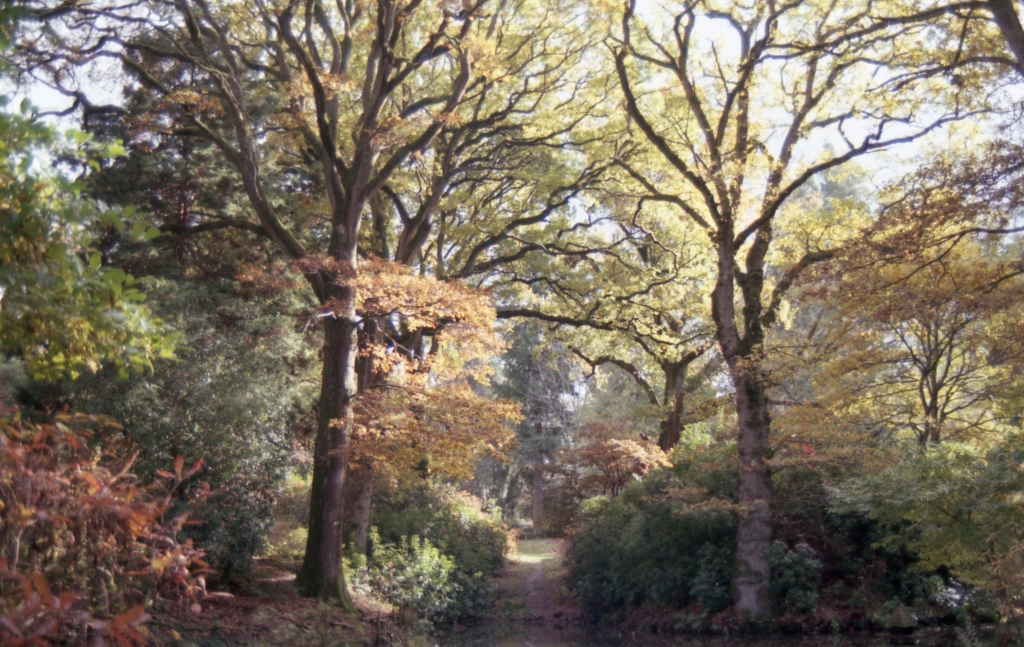
In my ongoing efforts to sharpen my ability to “see” in black and white, I was looking at a series of images I originally took with colour print film. The one below caught my attention as a possible candidate for the monochrome treatment.
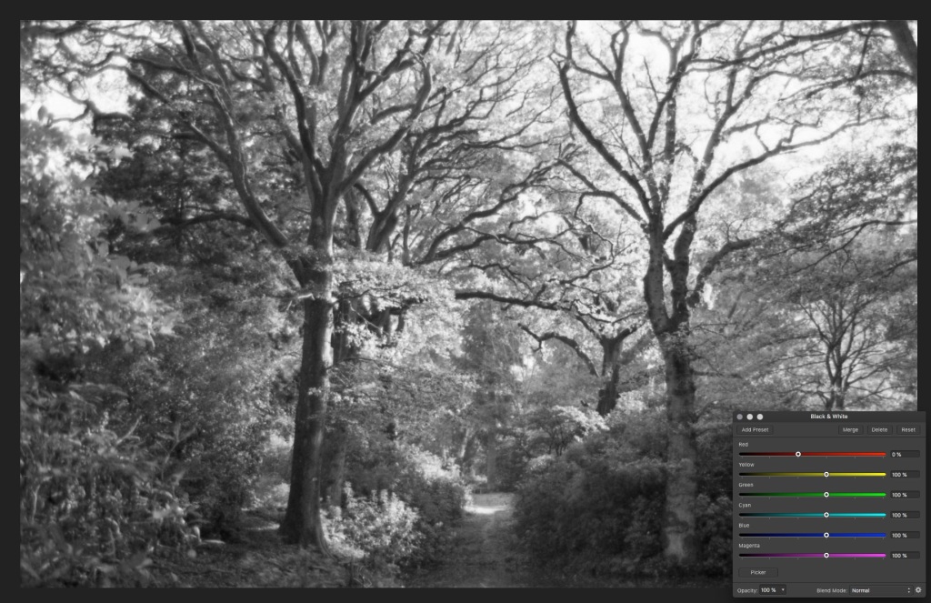
With the image in the photo editor, I simply did a black and white conversion. It looked ok but lacked the contrast I like. So within the conversion, there was the provision to bring the Red slider to 0% which accomplished what I was looking for. (as seen below)
I like the variety of tones in the image and actually prefer it to the colour original. Could I repeat this in the darkroom?
It takes me about half an hour to set everything up before I can make my test strip, pictured below.
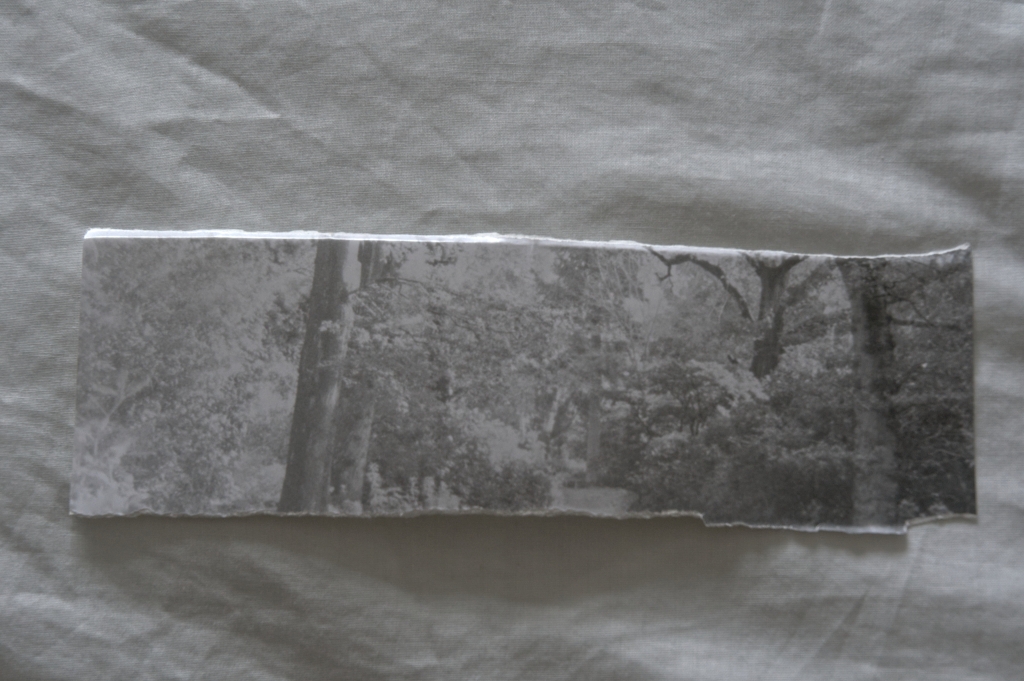
Going from left to right, I give the first exposure 5 seconds then cover up part of the print. Then every 2 seconds I cover a little more of the print until 19 seconds has elapsed. I am accustomed to giving a black and white print from a monochrome negative around 7-10 seconds, so giving this print 17 seconds seemed very generous.
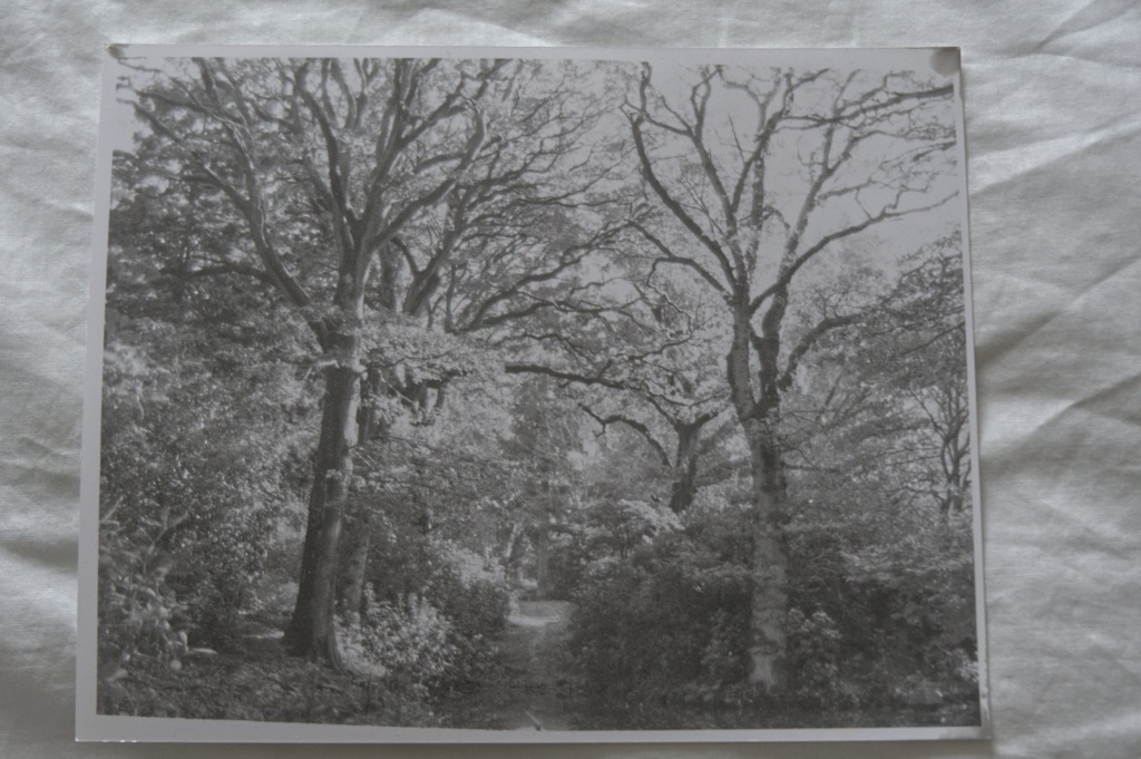
On examination, the image lacks the contrast I was looking to get, as in the digital conversion. Would 20 seconds give me what I was looking for?
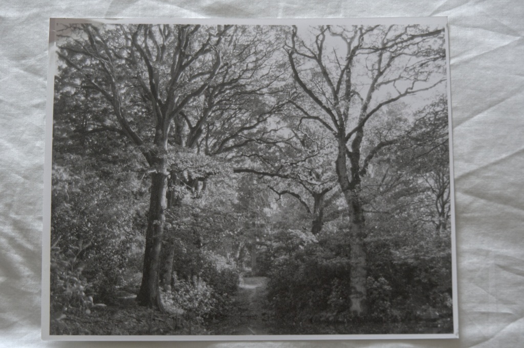
Yes was the answer. Let’s just compare it with the digital version, below.
Granted, the image lacks the contrast of the digital image, probably because of the difference between projected light from the computer and reflected light from the print. However, I’ve lost the brightness half way up the first tree on the left. Should I go a little longer, say 22 seconds, perhaps with some dodging around that area of brightness in the tree on the left? Or is there something else I could do to achieve that result? Maybe. Sadly my time was up for this session.
To be continued…..

The long gone Kodak Panalure paper, gave very good results from C41 negatives.
I’ll be interested in how you overcome the orange mask (almost safelight colour) because even using V/C paper at grade 3 or 4 never gave me a truly pleasing print.
I would always end up beaching it in ‘very’ weak
Potassium ferricyanide.
LikeLiked by 1 person